
UI/UX Design
UI and UX design for web apps, mobile apps, eCommerce stores, dashboards, and landing pages - in Figma. Research, wireframes, high-fidelity screens, interactive prototypes, and developer-ready handoff. Design that works for users, not just looks good in a presentation.
Six signs your product needs a proper design pass.
Most design problems are not aesthetic - they are structural. These are the patterns we see most often on projects that come to us after a failed first attempt.
The desktop version looks fine. On a phone, text overflows, buttons are too small to tap, and forms are impossible to fill. Over 70% of Indian web traffic is mobile. Designing desktop-first and hoping it adapts is not a strategy.
Three different button styles, four shades of blue, headings at random sizes, spacing that is different on every page. The product looks like it was built by five people with no shared design system - because it was.
The primary CTA is buried below the fold, the same visual weight as secondary actions, or missing entirely on mobile. Good design makes the next step obvious. If users are confused about what to do, they leave.
No Figma file means developers are making design decisions in code - inconsistent spacing, improvised components, wrong fonts. Every dev decision that should have been a design decision costs time to redo.
Every number is the same size. Every chart is the same weight. The user cannot tell what matters most. Data-heavy interfaces need deliberate visual hierarchy - what to look at first, what is context, what is action.
No design system means every small tweak - changing a button label, updating a banner, adjusting spacing - goes to a developer. A proper component library lets your team make content changes without writing code.
Six design disciplines we work across.
Web App & SaaS UI
Multi-page web application design - onboarding, dashboard, settings, data tables, forms, empty states, error states, and mobile-responsive layouts. Component-based so development is systematic, not improvised screen by screen.
Mobile App UI
React Native app screens designed to platform standards - Android Material and iOS Human Interface Guidelines observed. Onboarding, home, listing, detail, cart, checkout, profile, and settings screens. Gestures and navigation patterns documented for developers.
eCommerce UX
Homepage, collection page, PDP, cart, checkout, and account pages designed for conversion - with filter UX, variant picker design, product image layouts, trust signals, and mobile-first checkout flow. Specific to Shopify or custom eCommerce platforms.
Dashboard & Admin UI
Data-heavy admin interfaces with deliberate visual hierarchy - KPI cards, charts, data tables, filters, sidebars, and action panels. Multi-role admin dashboards for CI4 and Laravel platforms. Information architecture mapped before any visual design begins.
Design System
Component library in Figma - buttons, inputs, cards, modals, navigation, tables, and all states (default, hover, active, disabled, error). Colour tokens, typography scale, spacing system, and icon set. Your team designs and builds faster from a shared foundation.
Landing Page Design
Conversion-focused landing pages for paid campaigns, product launches, and lead capture - above-the-fold hero, social proof section, feature breakdown, objection handling, and CTA. Designed for the specific audience and traffic source, not as a generic template.
How we go from brief to dev-ready Figma file.
Brief, audience definition, competitor review, and user journey mapping. Every screen is listed before we design any of them. Information architecture documented so there are no "we forgot this page" moments mid-project.
Layout and structure first, no colour or typography. Validated with you before we spend time on visual polish. Changes at wireframe stage are fast and cheap - changes at high-fidelity stage are not.
Full colour, typography, spacing, and component design. Every interactive state covered - hover, active, error, empty, loading. Two rounds of revisions included. Feedback collected in Figma comments, not over email.
Clickable prototype for key user flows. Figma Dev Mode handoff with auto-generated CSS values, spacing specs, and exported assets. Source file delivered - you own every frame, component, and token.
What you receive at project end.
We build what we design. If you need the Figma turned into a working CI4 app, Shopify theme, or React Native app - we do that too. Design and development under one roof means no translation loss.
Fixed-price design projects.
Scoped before we start - screen count, deliverables, and revision rounds agreed upfront. No hourly billing that spirals.
All prices exclusive of GST. Screen count and deliverables agreed before work starts. Get a scoping call
Questions about design projects.
Not sure how many screens you need? Tell us what you are building and we will scope it.
Start a Design ProjectInterfaces we have designed and shipped.
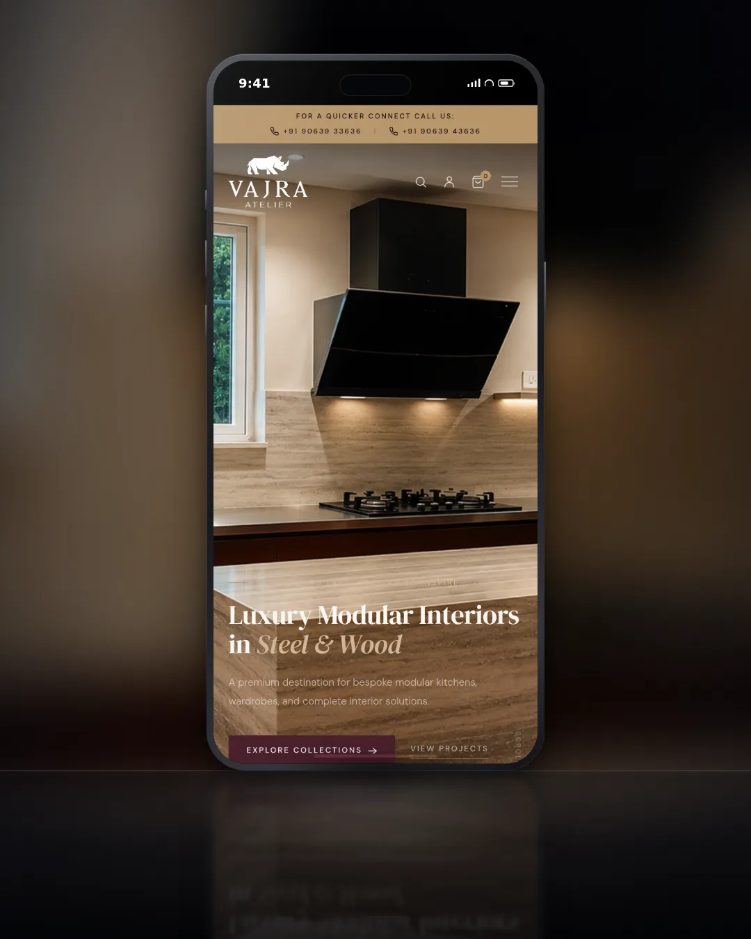
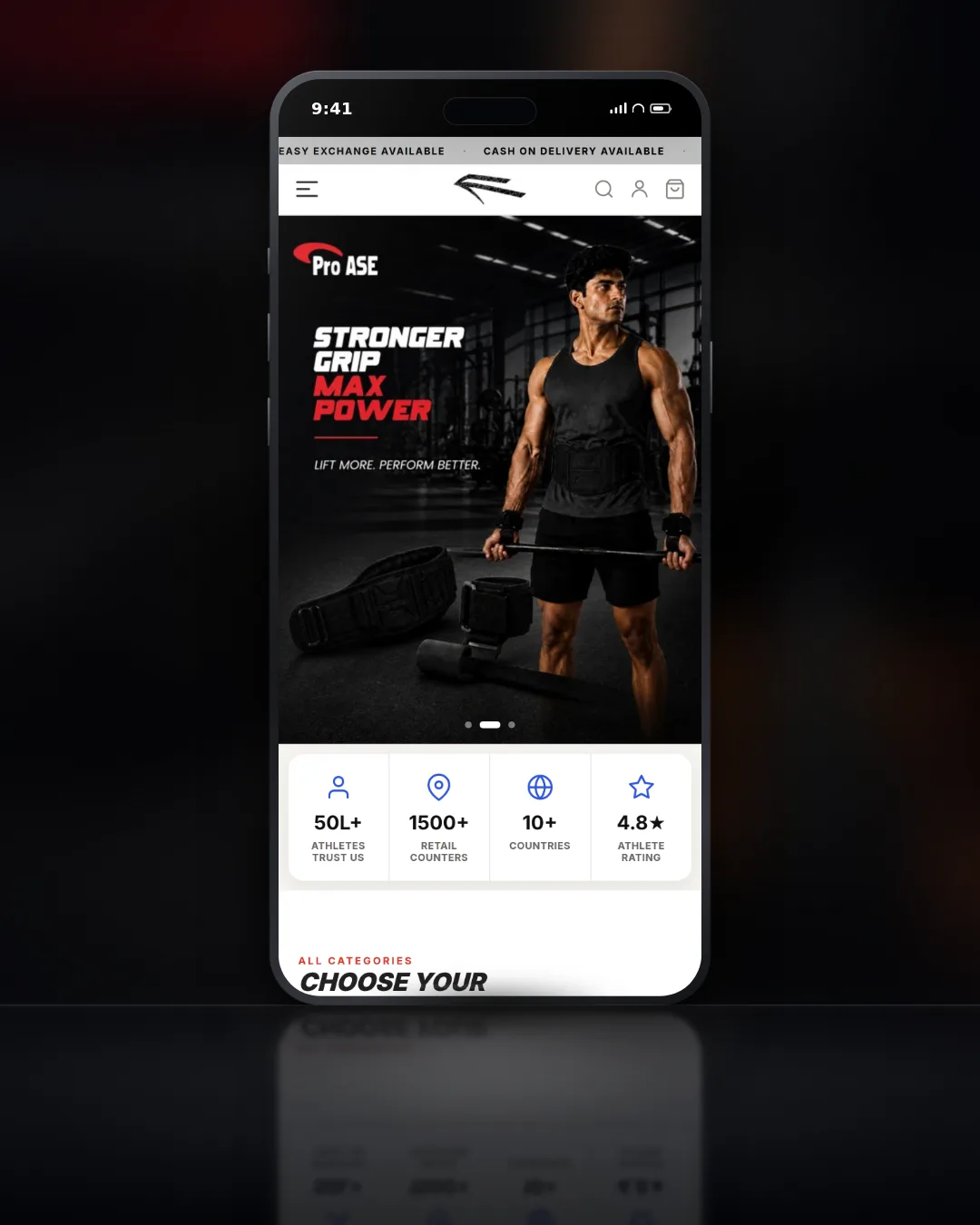
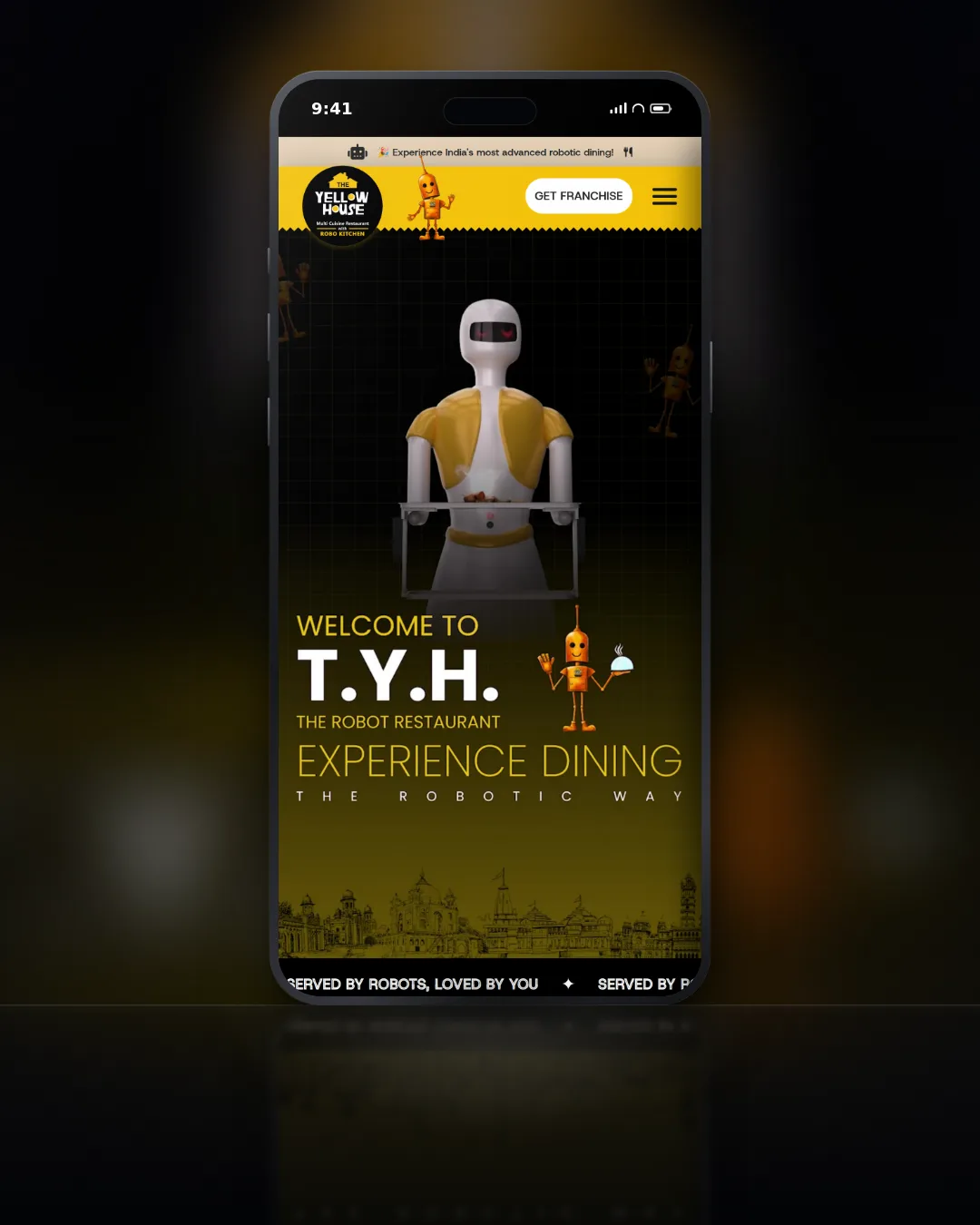
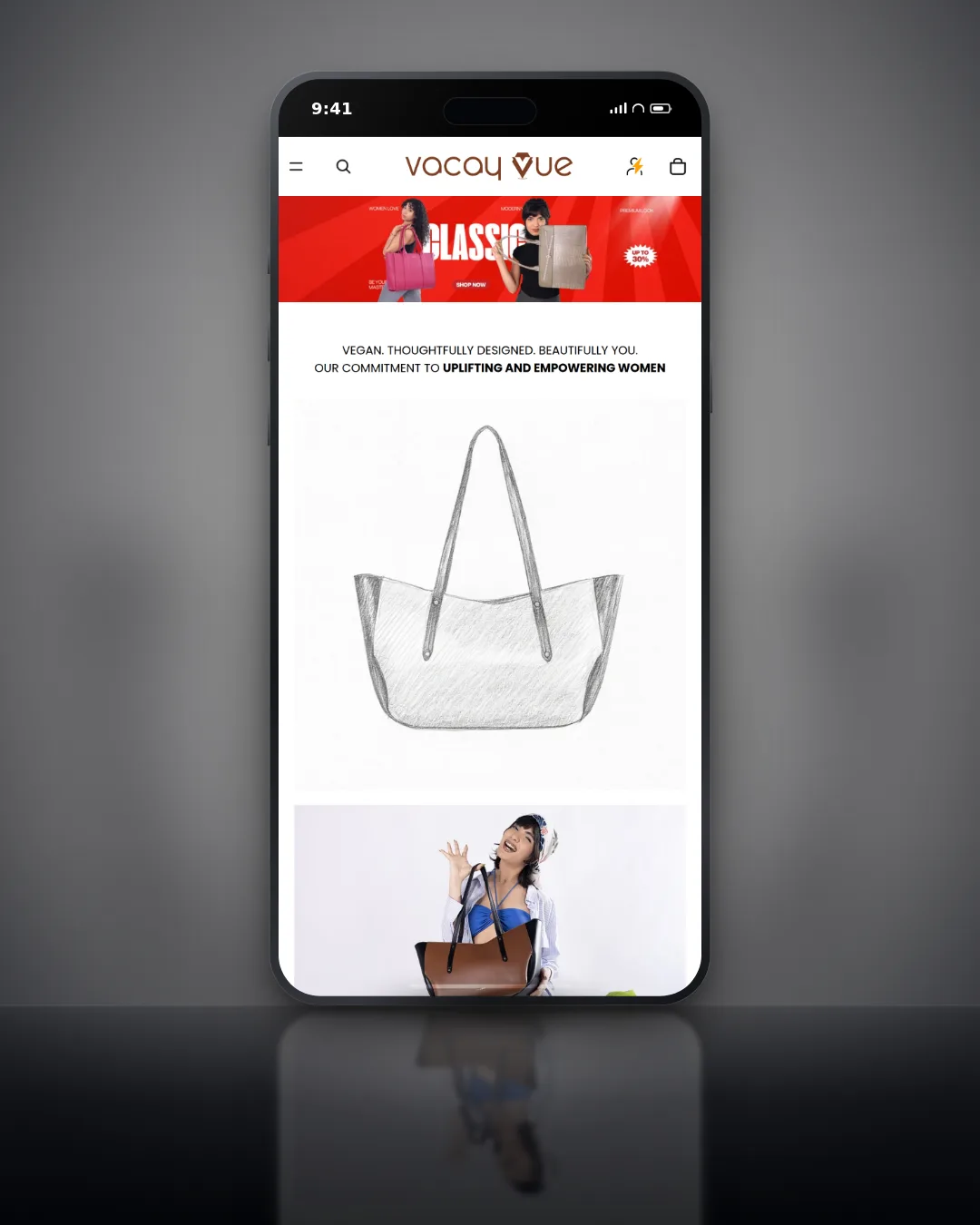
Design that developers can build from. Starting in Figma.
Wireframes, high-fidelity screens, component library, interactive prototype, and full developer handoff. Fixed price, agreed scope, two revision rounds.