01
Unreadable as a favicon
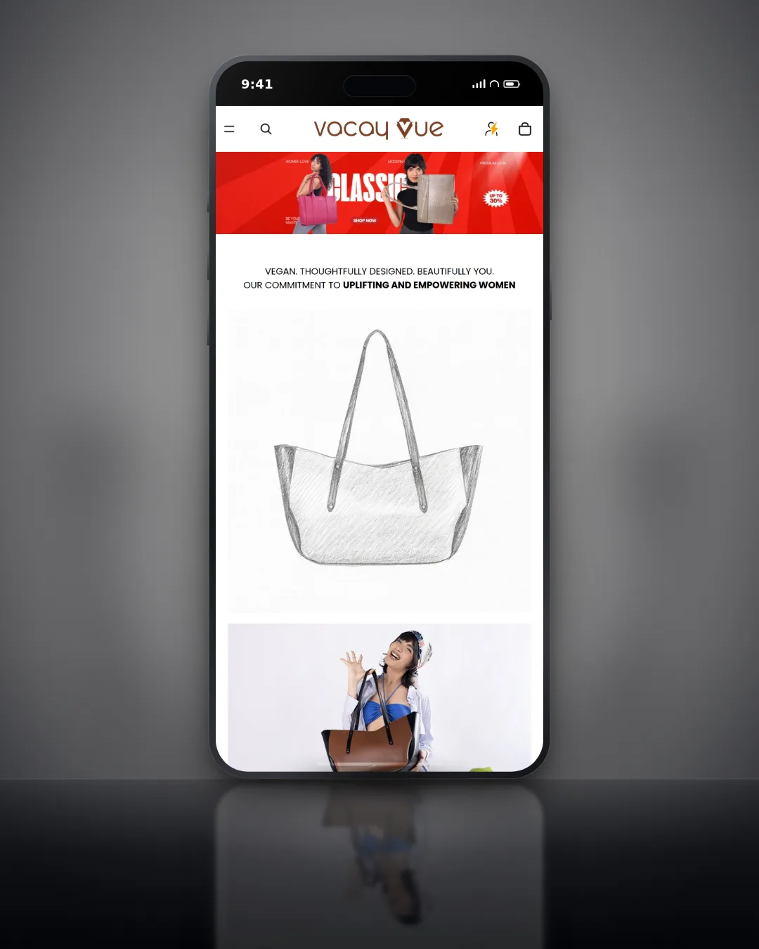
A detailed wordmark that looks great on a homepage turns into a smudge at 16 by 16 pixels in a browser tab. It is the single most common logo failure.
Smudge at 16pxClear submark


Custom logo design from our studio in Jaipur: a primary mark, a submark, a favicon and the rules for using them. Every concept is tested at browser-tab size and on dark backgrounds before you sign it off, and you get the vector source files with full ownership.
Drawn in vector, checked at every size.
Concepts are built in vector from day one, so the same file prints on a shop sign, a box and a business card, and still reads as a favicon.
3
Concept directions
2
Revision rounds
16px
Favicon tested
Why logos fail
A logo is used in dozens of places its designer never saw. These are the six failures we are asked to fix most often, and each one is designed out from the first sketch.
A detailed wordmark that looks great on a homepage turns into a smudge at 16 by 16 pixels in a browser tab. It is the single most common logo failure.
Only a low-resolution PNG exists, so a banner or a box prints pixelated, or another designer has to redraw the logo from scratch.
The logo only works on white. On a dark website hero or a black box it disappears or looks wrong.
A template-style mark nobody checked against the category, so customers mix it up with another brand they already know.
Without clear space, minimum size and colour rules, every vendor uses the logo differently: stretched, recoloured or crowded.
A wide wordmark does not fit an Instagram profile photo or a WhatsApp Business icon, so it gets cropped awkwardly.
What you get
Every logo project delivers the versions you will actually need, in the formats a printer, a developer and a social media manager will each ask for.
The main wordmark or combination mark, used in your website header, on signage and on your main marketing materials.
A simplified square or icon-only version for profile photos, app icons and any space too small for the full mark.
Every mark tested for legibility at 16 by 16 pixels before it is final. If it does not read as a browser tab icon, it gets simplified until it does.
Full-colour, single-colour and reversed (white) versions, so the logo works on every background you will use.
Vector source files (AI, EPS, SVG) plus PNG and JPG exports at several sizes: everything a designer, printer or developer will ask for.
Minimum size, clear space, colour combinations and examples of misuse, so anyone placing the logo gets it right.
The size test
Before a direction is final we place it in the real places a customer sees it: a browser tab, a profile photo, a printed label and a storefront sign. A mark that only works large is sent back to the drawing board, not shipped.
Tiny sizes
Browser tabs, app icons and WhatsApp profile photos, where fine detail disappears.
Dark backgrounds
Dark website heroes, black packaging and night-mode apps.
Labels, boxes and business cards, where the vector file and the colour build matter.
Large format
Shop signs, banners and event backdrops, seen from across a room.
Logo types
The right structure depends on your name, where the logo will be used and how well known the brand already is. We recommend one in discovery and explain why.
The brand name set in custom or customised type. Strong when the name is short and distinctive, and it builds name recognition from day one.
Best for
Needs a separate square submark for avatars and favicons.
Initials or a single letter drawn as a mark. Useful when the full name is long, but it relies on people already knowing what the letters stand for.
Best for
Usually paired with the full name until the brand is well known.
A symbol and the brand name designed to work together and apart. The most flexible structure, and the one most growing brands choose.
Best for
Spacing and lock-up rules matter, so they go in the usage guide.
A pictorial or abstract icon with no text. Very compact and memorable once it is known, but hard to own as a brand-new business.
Best for
We almost always deliver it alongside a wordmark lock-up.
Text set inside a badge, seal or crest. It suits heritage, food and education brands, but fine detail can get lost at small sizes.
Best for
Needs a simplified version for small sizes, which we design with it.
File formats
You receive the full package, organised by version and colour, so you never have to ask a designer for "the logo in high resolution" again.
| Format | Type | Use it for | Who asks for it |
|---|---|---|---|
| AI | Vector source | Editing the logo and making new layouts | Designers, agencies |
| EPS | Vector | Print production, signage and embroidery | Printers, sign makers |
| SVG | Vector | Websites and apps, sharp on every screen | Developers |
| PNG | Raster, transparent | Slides, documents, social posts | Your team, marketers |
| JPG | Raster | Email, quick sharing, platforms that reject PNG | Anyone |
Full colour, one colour and reversed
Each format comes in every colour version.
Organised folders
Grouped by version, colour and format.
Yours to keep
Full IP transfer, no licence fees later.
Custom vs template
A template logo is quick and cheap on day one. The cost shows up when you print, trademark, rebrand a pack or try to stand out in a crowded category.
Template or generator logo
Custom logo from Impulsebyte
How we work
Four steps, agreed up front. You see three real directions, choose one, and we refine it until it works everywhere you need it.
Step 1
Positioning, target audience and a review of the competitive landscape, so the mark is distinctive, not just decorative.
Step 2
Three distinct directions, not endless small variations of one idea. You pick the one that fits, then we refine it.
Step 3
The chosen direction refined through 2 revision rounds, tested at favicon size and on dark backgrounds throughout.
Step 4
The complete package: every format, every version and the usage guidelines, with full IP transfer to you.
A typical Logo Only project
Client work
Pricing
Each package has a fixed scope and timeline agreed before we start. Choose a logo on its own, add the mini brand kit, or go to a full brand identity.
Logo Only
Primary mark and submark, ready for every format.
₹12K to ₹22K
1 to 2 weeks
Logo + Mini Brand Kit
The full logo system plus the basics to use it consistently.
₹22K to ₹40K
2 to 3 weeks
Full Brand Identity
A complete brand identity system, scoped on the Brand Identity page.
₹25K to ₹75K
3 to 5 weeks
All prices exclude GST. Full IP transfer on final payment.
Already have a logo?
We also refresh existing marks: we keep what customers already recognise and fix what does not work at small sizes, in print or on dark backgrounds.
FAQ
If your question is not here, put it in the form and you will get a straight answer.
Yes. Every logo project includes the vector source files in AI, EPS and SVG alongside PNG and JPG exports at several sizes. The files are organised by version and colour, and you own the full package, so any designer, printer or developer can work from it without coming back to us.
Three distinct directions, not variations of the same idea. Each is shown in context, for example on a website header and a social avatar, so you can judge it as it will be used. You choose one, and we refine that direction through 2 rounds of revisions.
A Logo Only project usually takes 1 to 2 weeks, and the Logo plus Mini Brand Kit takes 2 to 3 weeks. A full brand identity takes 3 to 5 weeks. The timeline depends mostly on how quickly feedback comes back on the concepts and revisions.
Yes, logo refresh projects are common. We look at what is working in your current mark and what customers already recognise, then evolve it so it works at small sizes, in print and on dark backgrounds, rather than throwing away brand equity you have already built.
No. Trademark search and registration is a legal process outside our scope. We review the competitive landscape during discovery, but for formal clearance and registration we recommend a trademark attorney once you have chosen a direction.
You do. Full intellectual property rights transfer to you on final payment, along with all source files. There are no licence fees, usage limits or renewal costs, and you can use and modify the logo anywhere you like.
A logo is the mark itself, with its versions and files. A brand identity is the wider system around it: colour palette, typography, patterns, guidelines and designed applications. Our Logo plus Mini Brand Kit sits in between, with a palette, type selection and a one-page usage guide.
Your brand name, a short description of what you sell and to whom, the competitors you know of, and any logos you like or dislike with a line on why. If you have an existing logo or colours, send those too. Then we book the discovery call.
Yes. The studio is in Jaipur, and we work with brands across India and abroad. Discovery and concept reviews happen on video calls, feedback is collected in one shared document, and final files are delivered online.
The map pack is ranked on three things Google names publicly, and only two of them are yours to change. Here is what that means in practice for a Jaipur business, and which of the usual local SEO advice is a waste of your time.
Most of the risk in a WooCommerce to Shopify move is not the product data. It is the URL map, the things that were plugins and now have to be rebuilt, and in India the payment gateway, which does not come across at all.
Shopify handles a lot of technical SEO for you and leaves a specific set of problems it cannot fix. Here is which pages to fight for, the duplicate URL trap every store has, and what to do about supplier product copy.
Start your logo
Tell us about your brand. We reply with the package that fits, a fixed price and a timeline.
Free discovery call (30 min)
Your brand, your customers and the competitors you want to stand apart from.
Fixed-price proposal
Package, scope and timeline in writing before work starts.
Three concepts, then final files
Three directions, two revision rounds, full IP transfer.
Your brand name and what you sell are enough to start. Existing logos or references help too.