
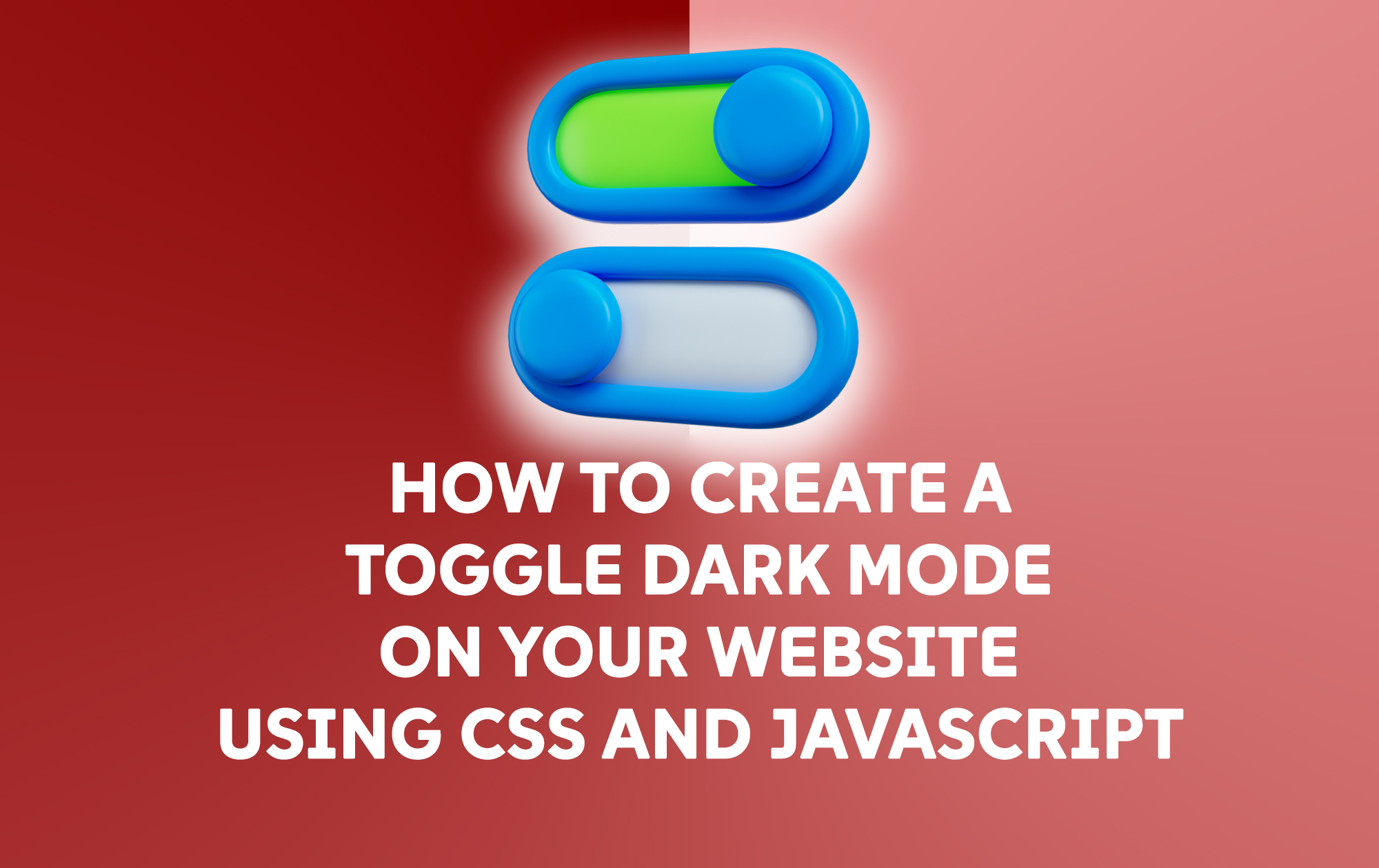
Dark mode is becoming increasingly popular among users for its aesthetic appeal and reduced eye strain. In this blog post, we’ll explore how to implement a toggle switch for dark mode on your website using CSS and JavaScript.
Step 1: Setting Up the HTML
First, we need to create a simple HTML structure. This will include a toggle button for switching between light and dark modes.
<!DOCTYPE html>
<html lang="en">
<head>
<meta charset="UTF-8">
<meta name="viewport" content="width=device-width, initial-scale=1.0">
<title>Dark Mode Toggle</title>
<link rel="stylesheet" href="styles.css">
</head>
<body>
<div class="container">
<h1>Toggle Dark Mode Example</h1>
<label class="switch">
<input type="checkbox" id="toggle">
<span class="slider"></span>
</label>
</div>

<script src="script.js"></script>
</body>
</html>
Explanation:
– We created a container with a heading and a label element that contains an input checkbox.
– The checkbox will act as our toggle switch for switching between light and dark modes.
Step 2: Adding CSS Styles
Now, let’s style our page and create the dark mode styles. We’ll also style the toggle switch.
/* styles.css */

body {
margin: 0;
font-family: Arial, sans-serif;
transition: background-color 0.3s, color 0.3s;
}

.container {
text-align: center;
padding: 50px;
}

.switch {
position: relative;
display: inline-block;
width: 60px;
height: 34px;
}

.switch input {
opacity: 0;
width: 0;
height: 0;
}

.slider {
position: absolute;
cursor: pointer;
top: 0;
left: 0;
right: 0;
bottom: 0;
background-color: #ccc;
transition: .4s;
border-radius: 34px;
}

.slider:before {
position: absolute;
content: "";
height: 26px;
width: 26px;
left: 4px;
bottom: 4px;
background-color: white;
transition: .4s;
border-radius: 50%;
}

input:checked + .slider {
background-color: #66bb6a;
}

input:checked + .slider:before {
transform: translateX(26px);
}

/* Dark Mode Styles */
body.dark-mode {
background-color: #121212;
color: #ffffff;
}
Explanation:
– The `body` styles include a smooth transition for background color and text color.
– We created a toggle switch using CSS with a slider effect. The `.slider` class represents the visual part of the toggle.
– When the checkbox is checked, the background color of the slider changes, and the toggle moves to the right.
– The `.dark-mode` class changes the background color and text color when dark mode is enabled.
Step 3: Implementing JavaScript for Toggle Functionality
Now, let’s add the JavaScript that will handle the toggle functionality.
// script.js

const toggle = document.getElementById('toggle');

toggle.addEventListener('change', () => {
document.body.classList.toggle('dark-mode');
});
Explanation:
– We select the toggle checkbox using `document.getElementById`.
– We add an event listener for the `change` event. When the checkbox is toggled, we toggle the `dark-mode` class on the `body` element.
Step 4: Testing the Dark Mode Toggle
Now that we have completed the HTML, CSS, and JavaScript, it’s time to test our dark mode toggle. Open your HTML file in a web browser, and you should see a toggle switch. When you click it, the website should switch between light and dark modes smoothly.
Step 5: Optional – Saving User Preference
To enhance the user experience, you might want to save the user’s preference for dark mode in `localStorage`. This way, the selected mode will persist even after the page is refreshed.
Update your JavaScript as follows:
// script.js

const toggle = document.getElementById('toggle');

// Check for saved user preference in localStorage
if (localStorage.getItem('dark-mode') === 'enabled') {
document.body.classList.add('dark-mode');
toggle.checked = true; // Set the toggle to checked
}

// Toggle dark mode and save preference
toggle.addEventListener('change', () => {
document.body.classList.toggle('dark-mode');

// Save the user's preference
if (document.body.classList.contains('dark-mode')) {
localStorage.setItem('dark-mode', 'enabled');
} else {
localStorage.removeItem('dark-mode');
}
});
Explanation:
– We check if the user has previously enabled dark mode by retrieving the value from `localStorage`.
– If dark mode is enabled, we add the `dark-mode` class to the body and check the toggle.
– When the toggle is switched, we save the user’s preference in localStorage.
Conclusion
Congratulations! You have successfully implemented a toggle for dark mode on your website using CSS and JavaScript. This feature not only enhances the user experience but also allows users to customize their browsing environment. Feel free to expand upon this basic implementation by adding more styles or functionalities!
Now you can share this dark mode feature in your projects and make your websites more user-friendly. Happy coding!